Today FaceBook released a new way for iPhone users to interact with their network, a stunning app simply called Paper. The design team, led by former Apple designer Mike Matas and the team he brought to FaceBook with him in 2011 when his digital publishing company Push Pop Press was aquired.
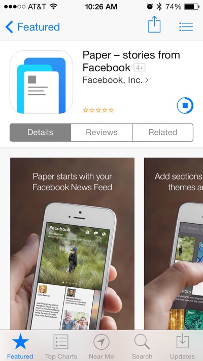 Paper is a free download from the App store, and signals a completely new way to interact with FaceBook, bridging the gap between news sources and your news feed.
 When you first launch the app you are greater by a short video into showing off the application with the simple title screen shown here.
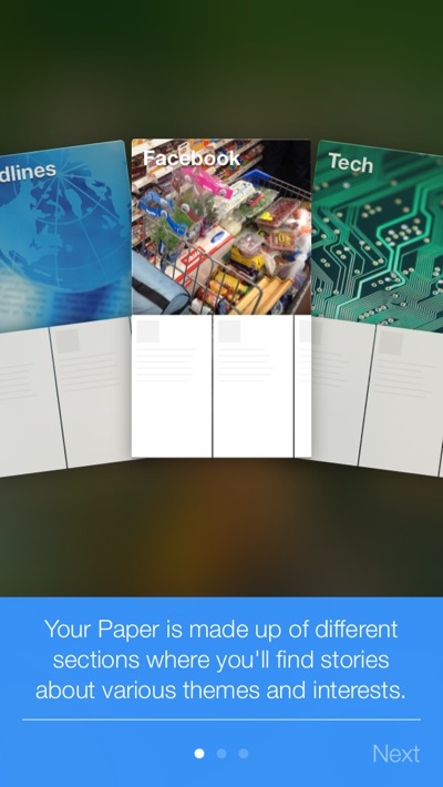 You are then guided through the process of adding additional news sections to your "Paper"
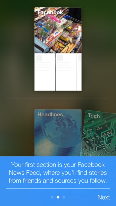 The tutorial guides you through the process explaining how the sections relate to each other.
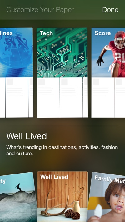 There are plenty of preconfigured sections available, and I would guess more will be coming as the application grows.
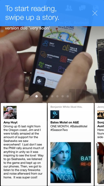 Once you finish adding sections, you are taken to your news feed. As you use the app, blue pop-over dialogs guide you through using the program.
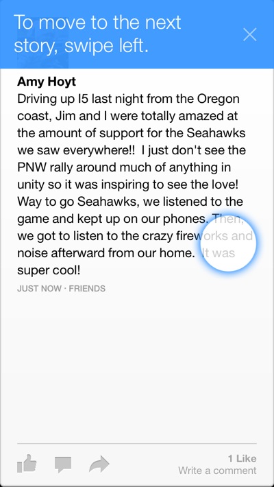
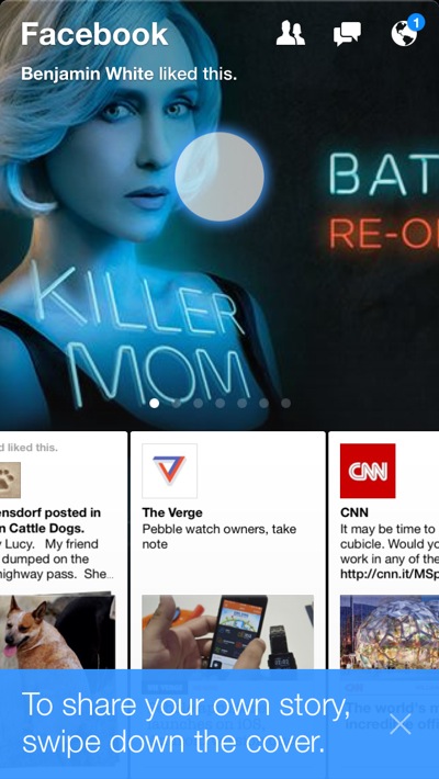
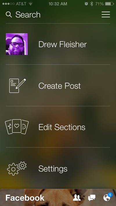
 Adding a post has the same elegance of the rest of the app. They did this thing right, and it shows they didn't miss a trick.
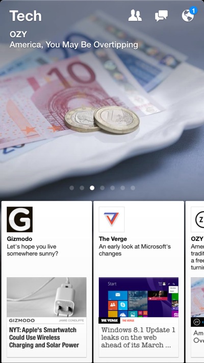 News sections are just as clean and easy to navigate. Swiping up takes you deeper, swiping down takes you back out closer to your timeline.
 Once you've tapped on an article to bring it up, swiping up "unfolds it", taking you to the website that is the source of the original article.
 Photos on your timeline display full screen, and pan when you turn your phone if they are wider than the phone.
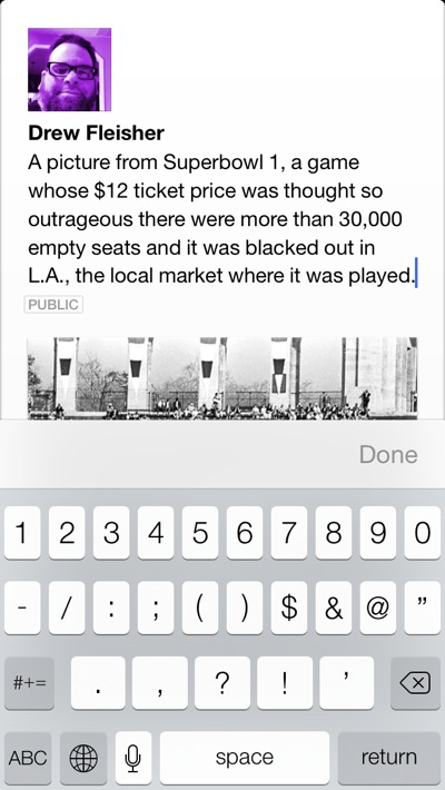 Re-posting a photo looks just as clean as anything else in the app. These guys really did a great job.
Conclusion
The folks on the Paper team have done what they were asked to do - try and disrupt FaceBook from the inside before someone outside had the chance to. Drawing on every design element Apple gave them to play with in iOS 7 this team has put together a smooth application that after just a few hours has replaced the regular FaceBook app on my iPhone, and I'm sure it will on yours as well. Trust me, once you spend a little time with it you will never go back.

